

5 tips for picking the perfect color palette for your home!
The color of your home needs to reflect your personality. While house color may not be something that all of us think about on a daily basis, it does affect our day-to-day lives. This is the place we come home to every day, the place we build families and where we make some of our greatest memories. Our home is the place where we feel safe, protected, comfortable. So while you may not consider its color every day, your home’s color plays a bigger role in your life than you may realize.
Don’t pay attention to things like the “current” color trends. Color trends come and go. Pick colors that reflect your personality, your family, and the things you like. Picking a color scheme is one of the most daunting tasks for any homeowner (especially newbies), so let’s break it down a little bit and see if we can provide some clarity on the subject!
Tip 1: Mind your surroundings.
You want your home to complement its surroundings. That means taking into account things like the garden and grass, whether or not your home is in an urban area or in the countryside. If you have a colourful garden, make sure to borrow from it and use some its colors to accent your home. In terms of landscape, follow the simple guidelines below to make sure your home fits in:
- Trees and shrubbery: go for deep greens and browns.
- Water views:compliment this landscape with blues, greens and turquoise tones.
- Mountains and cliffs:these look great with greens, greys and browns.
- Deserts: you will want to go with oranges, reds, and browns.
Tip 2: Use the 60-30-10 rule.
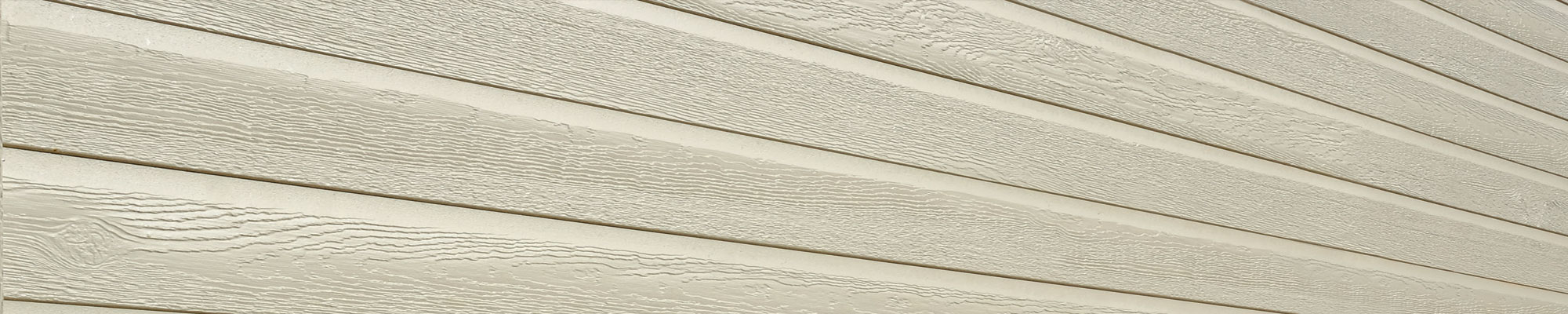
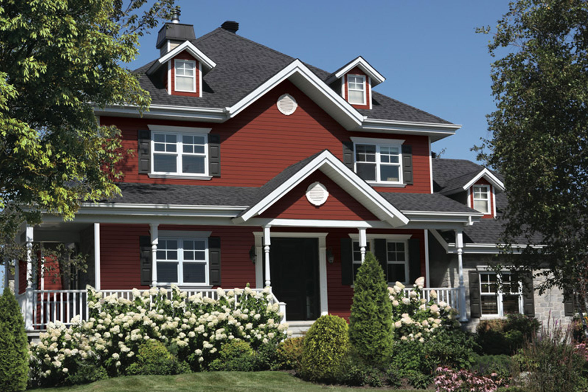
When you choose your color palette, make sure to implement the 60-30-10 rule. That means the primary color should take up 60% of the home (that’s the siding), the secondary color should take up 30% of the home (that’s the gables and accessories), and the accent should take up 10% of your home (those are the trims). Following this general rule of thumb will yield great results and strike a perfect balance between the colors you choose.
Tip 3: Borrow from the neighbours.
If you aren’t friendly with your neighbours, now may be a good time to start. You want your home to stand out in order to add curb appeal, but you don’t want it to stick out like a sore thumb. You also don’t want your neighbours to feel like you are “one-upping” them, and you certainly DO want your home to flow harmoniously with theirs. So how do we do this? Borrow at least one color from your neighbour’s color scheme and include it in your own. It doesn’t have to be the primary, or even the secondary, but as long as you include a color from your neighbours’ home as an accent (at a minimum), your home will harmonize with theirs and flow beautifully. Employing this trick will allow your home to still have a distinct “stand-out” primary color while still blending in perfectly (the neighbours may not even realize how much better looking your home is ;) ).
Tip 4: Complement the architecture of the home.
While you may want to go crazy with your house color, there are still some limitations that you have to be mindful of. Make sure the color palette you go with doesn’t work against the architecture of the home. For example, if you have a colonial style home it may look great with dark, strong colors but a french colonial may be better suited for a lighter color palette.
Tip 5: Use your personal style.
This may be the single most important tip for picking the right color scheme. The type of person you are plays a crucial role in the color palette for your home and you should definitely take your personal preferences into consideration when making this decision. Your home is an extension of you. In the next few weeks we will be publishing a post that explores this in more detail, but for now, feel free to follow these simple guide lines to match color to your personality:
- Red: positive, strong, warm, energetic.
- Blue: Intelligent, trusting, efficient, cool, calm.
- Yellow: optimistic, confident, extroverted, friendly, warm, creative.
- Orange: comfort, warmth, security, fun.
- Green: balanced, harmonious, refreshing, reassuring.
- White: pure, clean, sophisticated, efficient.
- Brown: warm, earthy, reliable, supportive, strong.
What color is your home? Share in the comments below, and stay tuned for more tips on picking the perfect color palette for your home! In the meantime, check out our Home Designer page if you’re looking for some inspiration.